1. Matplotlib – Introduction
What is Matplotlib?
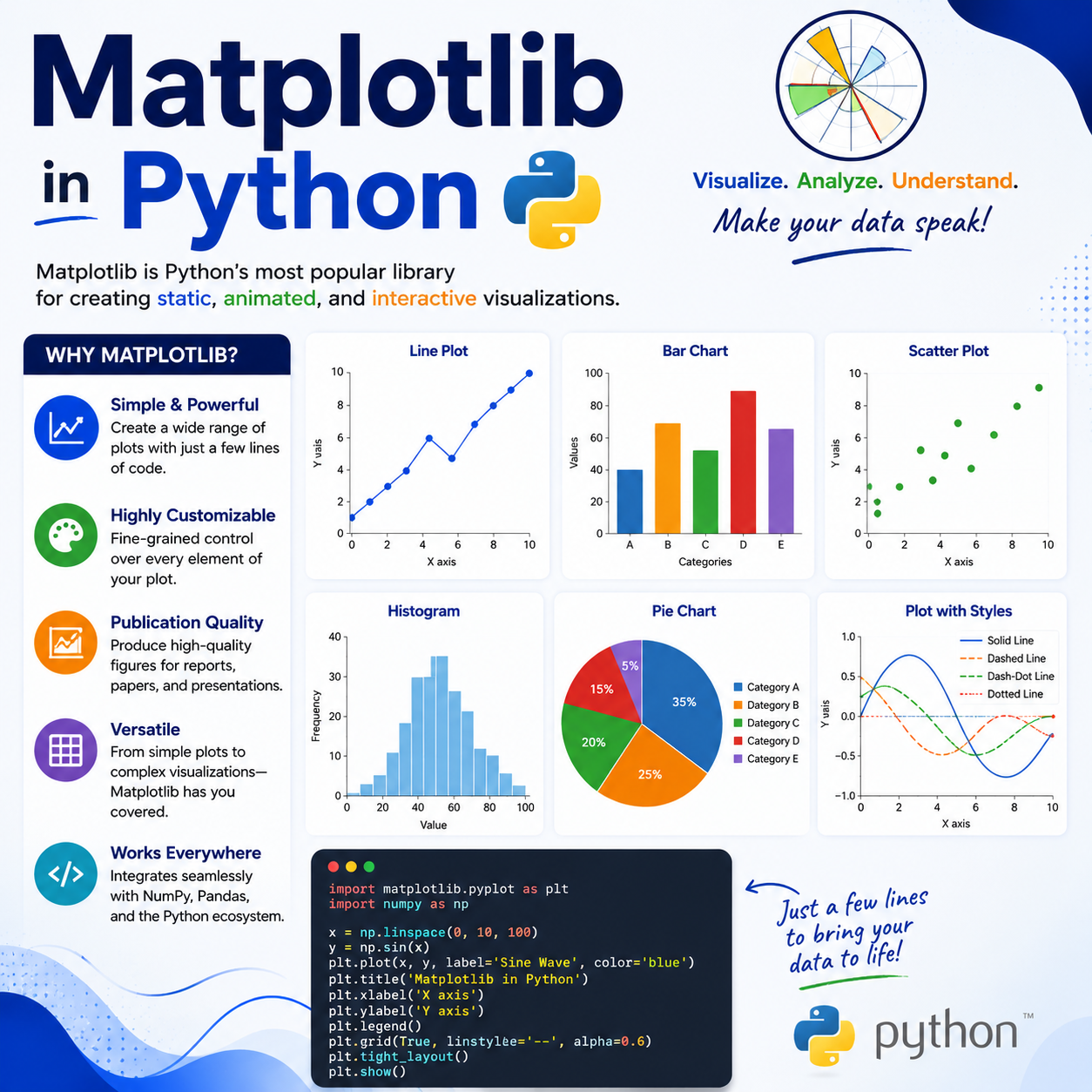
Matplotlib is a powerful, open-source Python library used for creating visualizations — charts, graphs, plots, and figures of all kinds. It is the foundation of data visualization in Python.
Why use Matplotlib?
- Creates professional-quality charts with just a few lines of code
- Supports dozens of chart types: line, bar, pie, scatter, histogram, and more
- Works seamlessly with Pandas and NumPy
- Highly customizable — colors, fonts, sizes, labels, everything
- Works in Jupyter Notebooks, scripts, and web applications
How to install Matplotlib:
pip install matplotlibHow to import Matplotlib:
import matplotlib.pyplot as pltThe alias
pltis the universally accepted convention. You’ll see it in every Matplotlib example.
2. Matplotlib – Pyplot
What is Pyplot?
pyplot is a module inside Matplotlib that provides a simple interface for creating plots. It works like a state machine — you build up a plot step by step, and then display it.
- Think of it as a drawing board — each function call adds something to the drawing
plt.plot()draws the chartplt.show()displays it on screen
Example: Your very first plot
import matplotlib.pyplot as plt

x = [1, 2, 3, 4, 5]
y = [10, 20, 30, 40, 50]

plt.plot(x, y)
plt.show()
This draws a simple straight line graph with x values on the horizontal axis and y values on the vertical axis.
Example: Plot without x values (auto index)
import matplotlib.pyplot as plt

values = [3, 8, 1, 10, 5]
plt.plot(values)
plt.show()
When no x values are given, Matplotlib automatically uses 0, 1, 2, 3, … as the x-axis.
Key Pyplot functions you’ll use often:
plt.plot()— Draw a line chartplt.show()— Display the chartplt.title()— Add a titleplt.xlabel()/plt.ylabel()— Label the axesplt.savefig()— Save the chart as an image file
3. Matplotlib – Marker
What is a Marker?
A marker is a symbol placed at each data point on your plot. By default, Matplotlib draws only a line. Adding markers makes each individual data point clearly visible.
Syntax:
plt.plot(x, y, marker="symbol")Common Marker Symbols:
| Marker Code | Shape |
|---|---|
"o" | Circle |
"*" | Star |
"s" | Square |
"^" | Triangle (up) |
"v" | Triangle (down) |
"+" | Plus sign |
"x" | X mark |
"D" | Diamond |
"." | Small dot |
"p" | Pentagon |
Example: Circle marker
import matplotlib.pyplot as plt

x = [1, 2, 3, 4, 5]
y = [10, 25, 15, 40, 30]

plt.plot(x, y, marker="o")
plt.show()
Example: Star marker
plt.plot(x, y, marker="*")
plt.show()
Example: Diamond marker
plt.plot(x, y, marker="D")
plt.show()
4. Matplotlib – Line & Color
Customizing Line Style and Color
You can control how the line looks using the linestyle and color parameters.
Line Styles:
| Code | Style |
|---|---|
"-" | Solid line (default) |
"--" | Dashed line |
"-." | Dash-dot line |
":" | Dotted line |
"None" | No line (only markers) |
Color Options:
You can use color names, short codes, or hex values:
| Short Code | Color |
|---|---|
"r" | Red |
"g" | Green |
"b" | Blue |
"k" | Black |
"w" | White |
"y" | Yellow |
"m" | Magenta |
"c" | Cyan |
Example: Dashed red line
import matplotlib.pyplot as plt

x = [1, 2, 3, 4, 5]
y = [10, 25, 15, 40, 30]

plt.plot(x, y, linestyle="--", color="r")
plt.show()
Example: Dotted green line with star markers
plt.plot(x, y, linestyle=":", color="green", marker="*")
plt.show()
Shorthand format (marker + line + color in one string):
plt.plot(x, y, "o--r")   # circle markers, dashed line, red color
plt.plot(x, y, "*:b")    # star markers, dotted line, blue color
5. Matplotlib – Other Marker Attributes
Beyond just choosing the marker shape, you can fine-tune its appearance further.
Key marker attributes:
markersize(orms) — Size of the markermarkerfacecolor(ormfc) — Fill color of the markermarkeredgecolor(ormec) — Border/edge color of the markermarkeredgewidth(ormew) — Thickness of the marker border
Example: Large red-filled marker with blue border
import matplotlib.pyplot as plt

x = [1, 2, 3, 4, 5]
y = [10, 25, 15, 40, 30]

plt.plot(
    x, y,
    marker="o",
    markersize=15,
    markerfacecolor="red",
    markeredgecolor="blue",
    markeredgewidth=2
)
plt.show()
Example: Using shorthand aliases
plt.plot(x, y, marker="D", ms=12, mfc="yellow", mec="black", mew=1.5)
plt.show()
Combining these attributes gives you full creative control over how each data point looks on your chart.
6. Matplotlib – Other Line Attributes
Just like markers, the line connecting data points can be customized in detail.
Key line attributes:
linewidth(orlw) — Thickness of the linelinestyle(orls) — Style of the line (solid, dashed, etc.)color(orc) — Color of the linealpha— Transparency (0.0 = invisible, 1.0 = fully visible)
Example: Thick blue dashed line
import matplotlib.pyplot as plt

x = [1, 2, 3, 4, 5]
y = [10, 25, 15, 40, 30]

plt.plot(x, y, linewidth=4, linestyle="--", color="blue")
plt.show()
Example: Semi-transparent line
plt.plot(x, y, lw=3, color="green", alpha=0.4)
plt.show()
Example: Combining marker and line attributes together
plt.plot(
    x, y,
    marker="o", ms=10, mfc="orange",
    lw=2, ls="-.", color="purple", alpha=0.8
)
plt.show()
7. Matplotlib – Labels
Why add labels?
Without labels, your chart has no context. Labels on the x-axis and y-axis tell the viewer what the data represents.
Functions:
plt.xlabel("text")— Label for the horizontal axisplt.ylabel("text")— Label for the vertical axis
Example:
import matplotlib.pyplot as plt

x = [2020, 2021, 2022, 2023, 2024]
y = [100, 150, 130, 200, 180]

plt.plot(x, y, marker="o", color="blue")
plt.xlabel("Year")
plt.ylabel("Sales (in thousands)")
plt.show()
Customizing label font size and color:
plt.xlabel("Year", fontsize=14, color="darkblue")
plt.ylabel("Sales (in thousands)", fontsize=14, color="darkred")
Example with full customization:
import matplotlib.pyplot as plt

months = ["Jan", "Feb", "Mar", "Apr", "May"]
revenue = [5000, 7000, 6500, 9000, 8000]

plt.plot(months, revenue, marker="s", color="teal", lw=2)
plt.xlabel("Month", fontsize=13, labelpad=10)
plt.ylabel("Revenue ($)", fontsize=13, labelpad=10)
plt.show()
labelpadadds space between the axis and the label text — helpful when your tick values are long.
8. Matplotlib – Titles & Position
Adding a Title
Every chart should have a title that explains what it’s showing.
plt.title("text")Controlling title position:
loc— Horizontal alignment:"left","center"(default),"right"pad— Space between the title and the top of the chart
Example: Basic title
import matplotlib.pyplot as plt

x = [1, 2, 3, 4, 5]
y = [10, 25, 15, 40, 30]

plt.plot(x, y)
plt.title("My First Chart")
plt.show()
Example: Left-aligned title
plt.title("Monthly Sales", loc="left")Example: Right-aligned title with padding
plt.title("Revenue Report", loc="right", pad=20)Example: Full chart with title and labels
import matplotlib.pyplot as plt

months = ["Jan", "Feb", "Mar", "Apr", "May"]
sales = [5000, 7000, 6500, 9000, 8000]

plt.plot(months, sales, marker="o", color="steelblue", lw=2)
plt.title("Monthly Sales Report – 2024", loc="center", pad=15)
plt.xlabel("Month")
plt.ylabel("Sales ($)")
plt.show()
9. Matplotlib – Font Properties
Customizing Fonts
Matplotlib lets you control font style, size, weight, family, and color for titles, labels, and tick marks.
Common font parameters (used inside title/label functions):
fontsize— Size of the text (e.g., 12, 14, 16)fontweight— Weight:"normal","bold","light"fontstyle— Style:"normal","italic","oblique"fontfamily— Font family:"serif","sans-serif","monospace"color— Text color
Using a fontdict for reusable font settings:
title_font = {
    "family": "serif",
    "color": "darkblue",
    "size": 20,
    "weight": "bold"
}

label_font = {
    "family": "sans-serif",
    "color": "darkred",
    "size": 14
}
Example: Applying fontdict
import matplotlib.pyplot as plt

x = [1, 2, 3, 4, 5]
y = [10, 25, 15, 40, 30]

title_font = {"family": "serif", "color": "darkblue", "size": 20, "weight": "bold"}
label_font = {"family": "sans-serif", "color": "darkred", "size": 13}

plt.plot(x, y, marker="o", color="steelblue")
plt.title("Sales Performance", fontdict=title_font)
plt.xlabel("Week", fontdict=label_font)
plt.ylabel("Units Sold", fontdict=label_font)
plt.show()
Controlling tick label font size globally:
plt.tick_params(axis="both", labelsize=12)10. Matplotlib – Gridlines & Their Properties
What are Gridlines?
Gridlines are horizontal and vertical lines drawn across the chart background. They make it easier to read values from a chart, especially when the data points are far from the axes.
Basic usage:
plt.grid(True)    # Turn on grid
plt.grid(False)   # Turn off grid
Customizing gridlines:
color— Color of the grid lineslinestyle— Line style ("-","--",":","-.")linewidth— Thickness of the grid linesalpha— Transparency (0 to 1)axis— Which grid to show:"both","x","y"
Example: Basic grid
import matplotlib.pyplot as plt

x = [1, 2, 3, 4, 5]
y = [10, 25, 15, 40, 30]

plt.plot(x, y, marker="o")
plt.grid(True)
plt.show()
Example: Customized grid
import matplotlib.pyplot as plt

x = [1, 2, 3, 4, 5]
y = [10, 25, 15, 40, 30]

plt.plot(x, y, marker="o", color="navy")
plt.grid(
    color="gray",
    linestyle="--",
    linewidth=0.8,
    alpha=0.6,
    axis="both"
)
plt.title("Sales Data with Gridlines")
plt.xlabel("Week")
plt.ylabel("Units")
plt.show()
Example: Show only horizontal gridlines
plt.grid(axis="y", linestyle=":", color="green", alpha=0.7)11. Matplotlib – Subplot
What is a Subplot?
A subplot lets you display multiple charts in a single figure window, arranged in rows and columns. This is extremely useful when you want to compare different datasets side by side.
Syntax:
plt.subplot(rows, columns, plot_number)rows— Number of rows in the gridcolumns— Number of columns in the gridplot_number— Position of the current plot (starts at 1)
Example: Two plots side by side
import matplotlib.pyplot as plt

x = [1, 2, 3, 4, 5]
y1 = [10, 25, 15, 40, 30]
y2 = [5, 15, 10, 30, 25]

plt.subplot(1, 2, 1)          # 1 row, 2 columns, position 1
plt.plot(x, y1, color="blue")
plt.title("Dataset A")

plt.subplot(1, 2, 2)          # 1 row, 2 columns, position 2
plt.plot(x, y2, color="red")
plt.title("Dataset B")

plt.suptitle("Comparison of Two Datasets")  # Overall title
plt.tight_layout()             # Prevents overlapping
plt.show()
Example: 2×2 grid of subplots
import matplotlib.pyplot as plt

x = [1, 2, 3, 4, 5]

plt.subplot(2, 2, 1)
plt.plot(x, [1, 4, 9, 16, 25], color="blue")
plt.title("Squares")

plt.subplot(2, 2, 2)
plt.plot(x, [1, 8, 27, 64, 125], color="green")
plt.title("Cubes")

plt.subplot(2, 2, 3)
plt.plot(x, [2, 4, 6, 8, 10], color="red")
plt.title("Doubles")

plt.subplot(2, 2, 4)
plt.plot(x, [1, 3, 5, 7, 9], color="purple")
plt.title("Odds")

plt.suptitle("Four Plots in One Figure")
plt.tight_layout()
plt.show()
Always call
plt.tight_layout()when using subplots — it automatically adjusts spacing so titles and labels don’t overlap.
12. Matplotlib – Scatter Plot
What is a Scatter Plot?
A scatter plot displays individual data points on a 2D graph without connecting them with lines. Each point represents one observation — defined by its x and y values.
When to use scatter plots:
- To see if two variables are related
- To spot outliers in data
- To visualize the distribution of a dataset
- To compare two numeric variables
Syntax:
plt.scatter(x, y)Example: Basic scatter plot
import matplotlib.pyplot as plt

x = [5, 10, 15, 20, 25, 30]
y = [20, 35, 25, 55, 45, 70]

plt.scatter(x, y)
plt.title("Hours Studied vs Exam Score")
plt.xlabel("Hours Studied")
plt.ylabel("Exam Score")
plt.show()
Each dot represents one student’s hours studied and their corresponding exam score.
13. Matplotlib – Scatter Comparison
Comparing Two Datasets on the Same Scatter Plot
You can plot two (or more) sets of data on the same scatter plot by calling plt.scatter() multiple times. Adding a legend helps identify which points belong to which group.
Example: Comparing two student groups
import matplotlib.pyplot as plt

# Group A
x1 = [5, 10, 15, 20, 25]
y1 = [40, 55, 60, 75, 85]

# Group B
x2 = [3, 8, 12, 18, 22]
y2 = [30, 45, 50, 65, 72]

plt.scatter(x1, y1, label="Group A", color="blue")
plt.scatter(x2, y2, label="Group B", color="red")

plt.title("Study Hours vs Scores – Two Groups")
plt.xlabel("Hours Studied")
plt.ylabel("Exam Score")
plt.legend()
plt.show()
What the legend does:
label="Group A"— assigns a name to the scatter seriesplt.legend()— displays the legend box on the chart
Example: Three datasets compared
import matplotlib.pyplot as plt

plt.scatter([1,2,3], [10,20,30], label="Batch 1", color="blue")
plt.scatter([1,2,3], [15,25,35], label="Batch 2", color="orange")
plt.scatter([1,2,3], [8, 18, 28], label="Batch 3", color="green")

plt.title("Batch Comparison")
plt.legend()
plt.show()
14. Matplotlib – Scatter Color
Coloring Scatter Points
You can color scatter points in several ways:
- A single color for all points
- A list of different colors for each point
- A colormap (gradient of colors based on a value)
Example: Single color
import matplotlib.pyplot as plt

x = [5, 10, 15, 20, 25]
y = [40, 55, 60, 75, 85]

plt.scatter(x, y, color="purple")
plt.title("Single Color Scatter")
plt.show()
Example: Different color for each point
import matplotlib.pyplot as plt

x = [5, 10, 15, 20, 25]
y = [40, 55, 60, 75, 85]
colors = ["red", "blue", "green", "orange", "purple"]

plt.scatter(x, y, color=colors)
plt.title("Multi-Color Scatter")
plt.show()
Example: Colormap (automatic gradient coloring)
import matplotlib.pyplot as plt

x = [5, 10, 15, 20, 25]
y = [40, 55, 60, 75, 85]
intensity = [10, 30, 50, 70, 90]   # Values that drive the color

scatter = plt.scatter(x, y, c=intensity, cmap="viridis")
plt.colorbar(scatter)              # Shows the color scale legend
plt.title("Scatter with Colormap")
plt.show()
Popular colormaps:
"viridis","plasma","coolwarm","Blues","Reds","rainbow"
15. Matplotlib – Scatter Size & Transparency
Controlling Point Size
Use the s parameter to control the size of each scatter point. You can set one size for all points, or a list of different sizes for each point.
Controlling Transparency
Use the alpha parameter (0.0 to 1.0) to make points transparent. This is especially useful when points overlap — transparency lets you see the density of clustered points.
Example: Fixed size
import matplotlib.pyplot as plt

x = [5, 10, 15, 20, 25]
y = [40, 55, 60, 75, 85]

plt.scatter(x, y, s=200)    # All points size 200
plt.title("Large Scatter Points")
plt.show()
Example: Variable sizes (bubble chart effect)
import matplotlib.pyplot as plt

x = [5, 10, 15, 20, 25]
y = [40, 55, 60, 75, 85]
sizes = [50, 100, 200, 400, 600]    # Each point has a different size

plt.scatter(x, y, s=sizes, color="teal")
plt.title("Variable Size Scatter (Bubble Effect)")
plt.show()
Example: Transparency for overlapping points
import matplotlib.pyplot as plt

import random
x = [random.randint(1, 10) for _ in range(100)]
y = [random.randint(1, 10) for _ in range(100)]

plt.scatter(x, y, s=100, color="blue", alpha=0.3)
plt.title("Transparent Points – Shows Overlap Density")
plt.show()
Example: Combining size, color, and transparency
import matplotlib.pyplot as plt

x = [5, 10, 15, 20, 25]
y = [40, 55, 60, 75, 85]

plt.scatter(x, y, s=[100, 200, 300, 400, 500],
            c=["red","blue","green","orange","purple"],
            alpha=0.6)
plt.title("Size + Color + Transparency")
plt.show()
16. Matplotlib – Bar Chart
What is a Bar Chart?
A bar chart displays data as rectangular bars. The height (or length) of each bar represents the value of that category. It’s perfect for comparing values across categories.
Syntax:
plt.bar(x, height)         # Vertical bars
plt.barh(y, width)         # Horizontal bars
Example: Vertical bar chart
import matplotlib.pyplot as plt

subjects = ["Math", "Science", "English", "History", "Art"]
scores = [85, 92, 78, 88, 95]

plt.bar(subjects, scores)
plt.title("Student Scores by Subject")
plt.xlabel("Subject")
plt.ylabel("Score")
plt.show()
Example: Horizontal bar chart
import matplotlib.pyplot as plt

subjects = ["Math", "Science", "English", "History", "Art"]
scores = [85, 92, 78, 88, 95]

plt.barh(subjects, scores)
plt.title("Student Scores by Subject (Horizontal)")
plt.xlabel("Score")
plt.show()
Use vertical bars when comparing a small number of categories. Use horizontal bars when category names are long.
17. Matplotlib – Bar Color & Size
Customizing Bar Appearance
You can change the color, width, and edge styling of bars to make your chart more readable and visually appealing.
Key parameters:
color— Fill color of the barsedgecolor— Border color of each barwidth— Width of each bar (default is 0.8; range 0 to 1)linewidth— Thickness of the bar border
Example: Custom colors
import matplotlib.pyplot as plt

subjects = ["Math", "Science", "English", "History", "Art"]
scores = [85, 92, 78, 88, 95]

plt.bar(subjects, scores, color="steelblue", edgecolor="black")
plt.title("Scores by Subject")
plt.show()
Example: Different color for each bar
import matplotlib.pyplot as plt

subjects = ["Math", "Science", "English", "History", "Art"]
scores = [85, 92, 78, 88, 95]
colors = ["#FF6B6B", "#4ECDC4", "#45B7D1", "#96CEB4", "#FFEAA7"]

plt.bar(subjects, scores, color=colors, edgecolor="black", linewidth=1.2)
plt.title("Colorful Scores Chart")
plt.show()
Example: Adjusting bar width
import matplotlib.pyplot as plt

subjects = ["Math", "Science", "English", "History", "Art"]
scores = [85, 92, 78, 88, 95]

plt.bar(subjects, scores, width=0.4, color="coral")   # Narrow bars
plt.title("Narrow Bar Chart")
plt.show()
18. Matplotlib – Histogram
What is a Histogram?
A histogram shows the distribution of a dataset — how frequently values fall into different ranges (called bins). Unlike bar charts, histograms work with continuous numeric data.
- The x-axis shows the data ranges (bins)
- The y-axis shows the frequency (how many values fell in that range)
- Each bar represents one bin
Syntax:
plt.hist(data, bins=n)Example: Basic histogram
import matplotlib.pyplot as plt

ages = [22, 25, 27, 23, 25, 28, 30, 22, 24, 26,
        29, 31, 23, 25, 27, 24, 28, 30, 22, 26]

plt.hist(ages, bins=5)
plt.title("Age Distribution")
plt.xlabel("Age")
plt.ylabel("Number of People")
plt.show()
Example: Customized histogram
import matplotlib.pyplot as plt

scores = [55, 60, 65, 70, 70, 75, 75, 80, 80, 80,
          85, 85, 85, 85, 90, 90, 92, 95, 98, 100]

plt.hist(scores, bins=8, color="steelblue", edgecolor="black", alpha=0.8)
plt.title("Exam Score Distribution")
plt.xlabel("Score")
plt.ylabel("Number of Students")
plt.grid(axis="y", alpha=0.5)
plt.show()
What bins means:
bins=5— divide the data into 5 equal ranges- More bins = more detail but can look noisy
- Fewer bins = smoother but less detail
- You can also pass a list:
bins=[50, 60, 70, 80, 90, 100]
19. Matplotlib – Pie Chart
What is a Pie Chart?
A pie chart shows data as slices of a circle, where each slice represents a proportion of the total. It’s best for showing percentages or parts of a whole.
Syntax:
plt.pie(values, labels=labels)Example: Basic pie chart
import matplotlib.pyplot as plt

subjects = ["Math", "Science", "English", "History", "Art"]
hours = [4, 3, 2, 1, 2]

plt.pie(hours, labels=subjects)
plt.title("Weekly Study Hours by Subject")
plt.show()
Example: Show percentages on slices
import matplotlib.pyplot as plt

subjects = ["Math", "Science", "English", "History", "Art"]
hours = [4, 3, 2, 1, 2]

plt.pie(hours, labels=subjects, autopct="%1.1f%%")
plt.title("Study Time Distribution")
plt.show()autopct="%1.1f%%"— displays percentage on each slice with 1 decimal place
20. Matplotlib – Pie Labels, Explode & Shadow
Enhancing Pie Charts
Matplotlib lets you separate slices, add drop shadows, and customize the starting angle of the pie.
Key parameters:
labels— List of text labels for each sliceexplode— Tuple to “pull out” slices from the center (value = distance)shadow— Adds a drop shadow behind the pie (True/False)startangle— Rotates the start of the pie (default is 0°)
Example: Exploding a slice
import matplotlib.pyplot as plt

subjects = ["Math", "Science", "English", "History", "Art"]
hours = [4, 3, 2, 1, 2]
explode = [0.1, 0, 0, 0, 0]   # Pull out the first slice (Math)

plt.pie(hours, labels=subjects, explode=explode, autopct="%1.1f%%")
plt.title("Highlighted: Math Study Time")
plt.show()
Example: With shadow and rotated start angle
import matplotlib.pyplot as plt

subjects = ["Math", "Science", "English", "History", "Art"]
hours = [4, 3, 2, 1, 2]
explode = [0.1, 0, 0, 0, 0]

plt.pie(
    hours,
    labels=subjects,
    explode=explode,
    autopct="%1.1f%%",
    shadow=True,
    startangle=90
)
plt.title("Study Time – With Shadow & Explode")
plt.show()
startangle=90starts the pie from the top (12 o’clock position), which is often more visually natural.
Example: Exploding multiple slices
explode = [0.1, 0.1, 0, 0.05, 0] # Pull out Math, Science, and slightly History21. Matplotlib – Pie Colors & Legends
Customizing Pie Chart Colors
Use the colors parameter to assign specific colors to each slice.
Example: Custom colors
import matplotlib.pyplot as plt

subjects = ["Math", "Science", "English", "History", "Art"]
hours = [4, 3, 2, 1, 2]
colors = ["#FF6B6B", "#4ECDC4", "#45B7D1", "#96CEB4", "#FFEAA7"]

plt.pie(hours, labels=subjects, colors=colors, autopct="%1.1f%%")
plt.title("Study Hours – Custom Colors")
plt.show()
Adding a Legend
Sometimes the labels on slices are too small or crowded. You can move the labels into a legend instead.
plt.legend()                              # Default legend
plt.legend(title="Subjects")              # With a title
plt.legend(loc="upper right")            # Positioned legend
Example: Pie chart with legend (no labels on slices)
import matplotlib.pyplot as plt

subjects = ["Math", "Science", "English", "History", "Art"]
hours = [4, 3, 2, 1, 2]
colors = ["#FF6B6B", "#4ECDC4", "#45B7D1", "#96CEB4", "#FFEAA7"]
explode = [0.05, 0, 0, 0, 0]

plt.pie(
    hours,
    labels=None,               # No labels on the slices
    colors=colors,
    explode=explode,
    autopct="%1.1f%%",
    shadow=True,
    startangle=140
)

plt.legend(subjects, title="Subjects", loc="upper right")
plt.title("Weekly Study Hours")
plt.show()
Full example combining everything:
import matplotlib.pyplot as plt

subjects = ["Math", "Science", "English", "History", "Art"]
hours = [4, 3, 2, 1, 2]
colors = ["#e74c3c", "#3498db", "#2ecc71", "#f39c12", "#9b59b6"]
explode = [0.1, 0, 0, 0, 0]

plt.pie(
    hours,
    labels=subjects,
    colors=colors,
    explode=explode,
    autopct="%1.1f%%",
    shadow=True,
    startangle=90
)

plt.title("Study Time Distribution", fontsize=15, fontweight="bold")
plt.legend(subjects, title="Subjects", loc="lower right", fontsize=9)
plt.tight_layout()
plt.show()
Quick Reference Table
| Method / Parameter | Description | Example |
|---|---|---|
import matplotlib.pyplot as plt | Import Matplotlib’s pyplot module | import matplotlib.pyplot as plt |
plt.plot(x, y) | Draw a line chart | plt.plot([1,2,3], [4,5,6]) |
plt.show() | Display the chart | plt.show() |
plt.savefig("name.png") | Save the chart as an image | plt.savefig("chart.png") |
marker="o" | Circle marker at each data point | plt.plot(x, y, marker="o") |
marker="*" | Star marker | plt.plot(x, y, marker="*") |
marker="s" | Square marker | plt.plot(x, y, marker="s") |
marker="D" | Diamond marker | plt.plot(x, y, marker="D") |
linestyle="--" | Dashed line | plt.plot(x, y, linestyle="--") |
linestyle=":" | Dotted line | plt.plot(x, y, linestyle=":") |
linestyle="-." | Dash-dot line | plt.plot(x, y, linestyle="-.") |
color="red" | Set line/element color | plt.plot(x, y, color="red") |
markersize / ms | Size of markers | plt.plot(x, y, ms=12) |
markerfacecolor / mfc | Fill color of marker | plt.plot(x, y, mfc="yellow") |
markeredgecolor / mec | Border color of marker | plt.plot(x, y, mec="black") |
markeredgewidth / mew | Border thickness of marker | plt.plot(x, y, mew=2) |
linewidth / lw | Thickness of the line | plt.plot(x, y, lw=3) |
alpha | Transparency (0.0–1.0) | plt.plot(x, y, alpha=0.5) |
plt.xlabel("text") | Label for the x-axis | plt.xlabel("Month") |
plt.ylabel("text") | Label for the y-axis | plt.ylabel("Sales") |
plt.title("text") | Add a title to the chart | plt.title("My Chart") |
plt.title(loc="left") | Position the title | plt.title("T", loc="right") |
fontdict={...} | Apply font properties via dict | plt.title("T", fontdict=font) |
fontsize | Set font size | plt.xlabel("X", fontsize=14) |
fontweight="bold" | Bold text | plt.title("T", fontweight="bold") |
fontstyle="italic" | Italic text | plt.xlabel("X", fontstyle="italic") |
plt.grid(True) | Turn on gridlines | plt.grid(True) |
plt.grid(axis="y") | Only horizontal gridlines | plt.grid(axis="y") |
plt.grid(color, linestyle, linewidth, alpha) | Customize grid appearance | plt.grid(color="gray", ls="--") |
plt.subplot(r, c, n) | Create a subplot at position n | plt.subplot(1, 2, 1) |
plt.suptitle("text") | Overall title for all subplots | plt.suptitle("My Figure") |
plt.tight_layout() | Fix overlapping subplot spacing | plt.tight_layout() |
plt.scatter(x, y) | Draw a scatter plot | plt.scatter(x, y) |
plt.scatter(x, y, color=[...]) | Color scatter points | plt.scatter(x, y, color="blue") |
plt.scatter(x, y, c=data, cmap="viridis") | Colormap-based scatter coloring | plt.scatter(x, y, c=vals, cmap="plasma") |
plt.colorbar() | Display colormap scale legend | plt.colorbar(scatter) |
s=value | Scatter point size | plt.scatter(x, y, s=200) |
s=[list] | Variable size per point | plt.scatter(x, y, s=[50,100,200]) |
plt.legend() | Display legend | plt.legend() |
plt.bar(x, height) | Vertical bar chart | plt.bar(subjects, scores) |
plt.barh(y, width) | Horizontal bar chart | plt.barh(subjects, scores) |
edgecolor | Bar border color | plt.bar(x, y, edgecolor="black") |
width | Bar width (0–1) | plt.bar(x, y, width=0.4) |
plt.hist(data, bins=n) | Histogram | plt.hist(ages, bins=5) |
bins=[list] | Custom bin edges | bins=[50, 60, 70, 80, 90, 100] |
plt.pie(values, labels=[...]) | Pie chart | plt.pie(hours, labels=subjects) |
autopct="%1.1f%%" | Show percentages on pie slices | plt.pie(data, autopct="%1.1f%%") |
explode=(0.1, 0, 0, ...) | Pull out a pie slice | plt.pie(data, explode=explode) |
shadow=True | Add shadow to pie chart | plt.pie(data, shadow=True) |
startangle=90 | Rotate pie start position | plt.pie(data, startangle=90) |
colors=[...] | Custom colors for pie slices | plt.pie(data, colors=colors) |
plt.legend(title="text", loc="upper right") | Positioned legend with title | plt.legend(title="Items") |
Matplotlib has a lot more to offer — 3D plots, animations, heatmaps, and more. But once you’re confident with these fundamentals, you have everything you need to build clear, professional charts for any project. Practice makes perfect — try recreating charts from news articles or Kaggle datasets to sharpen your skills!