
1. Introduction to Bootstrap 5
- Bootstrap is a popular CSS framework for building responsive, mobile-first websites.
- It simplifies the process of designing with prebuilt components like navigation bars, forms, buttons, grids, etc.
- Mobile-first approach: The design adjusts itself based on the screen size.
2. Setting up Bootstrap 5
There are two ways to include Bootstrap in your project:
- CDN (Content Delivery Network): Easy way to start without downloading files.
<link href="https://cdn.jsdelivr.net/npm/bootstrap@5.3.0-alpha3/dist/css/bootstrap.min.css" rel="stylesheet">
<script src="https://cdn.jsdelivr.net/npm/bootstrap@5.3.0-alpha3/dist/js/bootstrap.bundle.min.js"></script>
- Download: Download Bootstrap files and link them to your project locally.
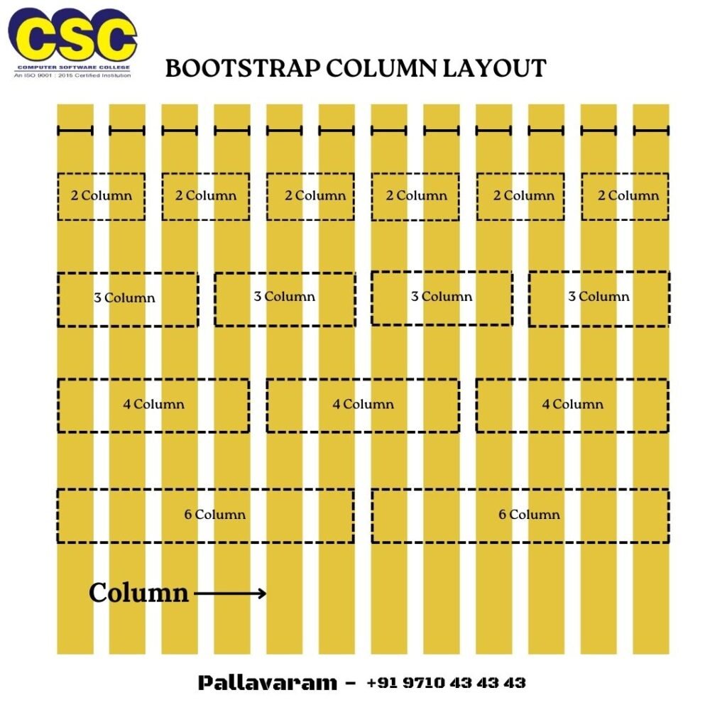
3. Grid System
- The Bootstrap grid system is based on a 12-column layout, which helps create flexible layouts.
- Containers are used to wrap site content:
.container,.container-fluid,.container-{breakpoint}. - Rows are wrappers for columns, and columns are defined using classes like
.col,.col-sm-6,.col-md-4, etc.
Example:
<div class="container">
  <div class="row">
    <div class="col-6">Column 1</div>
    <div class="col-6">Column 2</div>
  </div>
</div>
4. Typography
Bootstrap provides utility classes for styling text:
- Headings: Use
.h1,.h2,.h3for different heading sizes. - Paragraph: Standard
<p>tag or use.leadclass for larger, prominent text. - Text alignment: Use
.text-start,.text-center,.text-end.
Example:
<h1 class="h1">Heading 1</h1>

<p>This is a regular paragraph. It uses the standard styles and is part of the body text.</p>
<p class="lead">This is a lead paragraph. It is styled to stand out and draw the reader's attention</p>

<p class="text-start">This text is aligned to the start (left-aligned).</p>
<p class="text-center">This text is centered.</p>
<p class="text-end">This text is aligned to the end (right-aligned).</p>
5. Buttons
Bootstrap includes predefined button styles, and you can modify buttons using classes:
- Primary button:
.btn-primary - Secondary button:
.btn-secondary - Other variants:
.btn-danger,.btn-success,.btn-warning, etc.
Example:
<button class="btn btn-primary">Primary</button>
<button class="btn btn-secondary">Secondary</button>
<button class="btn btn-success">Success</button>
<button class="btn btn-danger">Danger</button>
<button class="btn btn-warning">Warning</button>
<button class="btn btn-info">Info</button>
<button class="btn btn-light">Light</button>
<button class="btn btn-dark">Dark</button>
<button class="btn btn-link">Link</button>


In a <button> tag
- The class
btnapplies the default Bootstrap button styles, such as padding, border-radius, and hover effects. - The
btn-primaryclass applies a primary color theme (blue by default) to the button. - If you use the same class name (e.g.,
btn btn-primary) in<button>,<a>, and<div>tags in Bootstrap ??
Summary of Effects
| Tag | Behavior |
|---|---|
<button> | Fully functional button with Bootstrap styling. |
<a> | Styled as a button but functions as a hyperlink (unless href="#" or javascript:void(0) is used). |
<div> | Styled as a button but has no interactive functionality unless handled via JavaScript. |
Practice Task
6. Forms
Bootstrap makes form design easy and responsive:
- Use
.form-controlto style inputs,.form-checkfor checkboxes, and.form-selectfor dropdowns. - Example of a form:
<form>
  <div class="mb-3">
    <label for="email" class="form-label">Email address</label>
    <input type="email" class="form-control" id="email">
  </div>
  <div class="mb-3">
    <label for="password" class="form-label">Password</label>
    <input type="password" class="form-control" id="password">
  </div>
  <button type="submit" class="btn btn-primary">Submit</button>
</form>
mb-3: Adds margin to the bottom of the element, spacing it from the next element.form-label: Applies styling to the label element, typically used for form fields.form-control: Applies default styling to form inputs like text fields, making them full-width and adding padding.btn: Applies basic button styling.btn-primary: Adds primary button styling (usually blue with white text).
7. Navbar
The navbar is a responsive component for navigation menus.
Navbar classes: .navbar, .navbar-expand-lg, .navbar-dark, .navbar-light.
Example:
<nav class="navbar navbar-expand-lg navbar-light bg-light">
  <a class="navbar-brand" href="#">Brand</a>
  <button class="navbar-toggler" type="button" data-bs-toggle="collapse" data-bs-target="#navbarNav">
    <span class="navbar-toggler-icon"></span>
  </button>
  <div class="collapse navbar-collapse" id="navbarNav">
    <ul class="navbar-nav">
      <li class="nav-item"><a class="nav-link" href="#">Home</a></li>
      <li class="nav-item"><a class="nav-link" href="#">About</a></li>
    </ul>
  </div>
</nav>
Here’s a breakdown of each class:
navbar: Applies basic styling for a navigation bar.navbar-expand-lg: Makes the navbar expandable on large screens (typically using a toggle on smaller screens).navbar-light: Applies a light color scheme to the navbar (light text on a light background).bg-light: Applies a light background color to the navbar.navbar-brand: Styles the brand name or logo in the navbar.navbar-toggler: Styles the button that toggles the navbar in smaller screens (hamburger menu).navbar-toggler-icon: Provides the icon (hamburger menu) for the navbar toggle button.collapse navbar-collapse: Hides the navbar content by default on smaller screens and reveals it when toggled.navbar-nav: Styles the list of navigation links.nav-item: Applies basic styling to each list item in the navbar.nav-link: Styles the links within the navbar items.
8. Images and Icons
Responsive Images: Add .img-fluid class to make images scale with the parent container.
- Placeholder images are temporary stand-ins for design or development purposes. Use these URLs for placeholder images:
- https://placehold.co/{width}x{height}
- https://via.placeholder.com/{width}x{height}
Example:
<!-- Local Images -->
<img src="image.jpg" class="img-fluid" alt="Responsive Image">

<!-- Placeholder Images -->
<img src="https://via.placeholder.com/150x100" class="img-fluid rounded" alt="Responsive and Rounded Rectangle">
<img src="https://placehold.co/100" class="img-fluid rounded-circle" alt="Responsive and Rounded Circle">
<!-- Rounded Pill -->
<img src="https://placehold.co/150x50" class="rounded-pill" alt="Pill shape">


<!-- Customized Placeholder Images -->
<img src="https://placehold.co/150x100/ff0000/ffffff?text=Placeholder" alt="Styled placeholder with Customized Text">
Icons: Bootstrap 5 doesn’t include an icon library by default. You can use external libraries like Font Awesome or Bootstrap Icons.
<head>
<!-- Other Tags -->
  <title>Bootstrap Icons Example</title>
  <!-- Bootstrap Icons CDN -->
  <link href="https://cdn.jsdelivr.net/npm/bootstrap-icons/font/bootstrap-icons.css" rel="stylesheet">
</head>
<body>
  <div>
    <button><i class="bi bi-heart"></i> Like</button>
    <button><i class="bi bi-share"></i> Share</button>
    <button><i class="bi bi-chat"></i> Comment</button>
  </div>
</body>
Explanation:
bi bi-heart: Represents the “Like” icon.bi bi-share: Represents the “Share” icon.bi bi-chat: Represents the “Comment” icon.
You can customize the icons further by adding classes like fs-3 for size adjustments or text-primary for color changes.
Font Awesome Icons
Font Awesome is a popular icon library and toolkit widely used in web development to add scalable vector icons to websites and applications. It simplifies the inclusion of high-quality icons, making them easy to style and customize.
Include Font Awesome Link
Method 1: add the following CDN link to your HTML <head>:
<link href="https://cdnjs.cloudflare.com/ajax/libs/font-awesome/6.5.0/css/all.min.css" rel="stylesheet">Method 2: Create your own customized font awesome free kit in their official site by using your email address
Font Awesome Icon Examples
- <i class=”fa-solid fa-heart fa-flip” style=”color: #ff0026;”></i>
- <i class=”fa-solid fa-share” style=”color: #3100ff;”></i>
- <i class=”fa-regular fa-comment”></i>
9. Modals
Modals are pop-up dialog boxes, triggered by buttons or links. Example:
<button type="button" class="btn btn-primary" data-bs-toggle="modal" data-bs-target="#myModal">
  Open Modal
</button>

<div class="modal fade" id="myModal" tabindex="-1" aria-labelledby="exampleModalLabel" aria-hidden="true">
  <div class="modal-dialog">
    <div class="modal-content">
      <div class="modal-header">
        <h5 class="modal-title" id="exampleModalLabel">Modal title</h5>
        <button type="button" class="btn-close" data-bs-dismiss="modal"></button>
      </div>
      <div class="modal-body">Modal Content</div>
      <div class="modal-footer">
        <button type="button" class="btn btn-secondary" data-bs-dismiss="modal">Close</button>
      </div>
    </div>
  </div>
</div>
10. Cards
Cards are a flexible and extensible content container with various options. Example:
<div class="card" style="width: 18rem;">
  <img src="https://placehold.co/200" class="card-img-top" alt="Card image">
  <div class="card-body">
    <h5 class="card-title">Card title</h5>
    <p class="card-text">Some quick example text.</p>
    <a href="#" class="btn btn-primary">Go somewhere</a>
  </div>
</div>
11. Responsive Utilities
Bootstrap offers responsive utility classes to show/hide content based on the screen size:
.d-none, .d-sm-block, .d-md-none are used for display control.
Example:
<div class="d-none d-lg-block">Visible on large screens</div>12. Carousel
The carousel is a slideshow for cycling through a series of content, built with CSS 3D transforms and a bit of JavaScript. It works with a series of images, text, or custom markup. It also includes support for previous/next controls and indicators.
  <div id="carouselExample" class="carousel slide" data-bs-ride="carousel">
    <!-- Indicators -->
    <div class="carousel-indicators">
      <button type="button" data-bs-target="#carouselExample" data-bs-slide-to="0" class="active" aria-current="true" aria-label="Slide 1"></button>
      <button type="button" data-bs-target="#carouselExample" data-bs-slide-to="1" aria-label="Slide 2"></button>
      <button type="button" data-bs-target="#carouselExample" data-bs-slide-to="2" aria-label="Slide 3"></button>
    </div>

    <!-- Slides -->
    <div class="carousel-inner">
      <div class="carousel-item active">
        <img src="https://placehold.co/1200x600" class="d-block w-100" alt="Banner 1">
        <div class="carousel-caption d-none d-md-block">
          <h5>First Slide</h5>
          <p>This is the first slide description.</p>
        </div>
      </div>
      <div class="carousel-item">
        <img src="https://placehold.co/1200x600" class="d-block w-100" alt="Banner 2">
        <div class="carousel-caption d-none d-md-block">
          <h5>Second Slide</h5>
          <p>This is the second slide description.</p>
        </div>
      </div>
      <div class="carousel-item">
        <img src="https://placehold.co/1200x600" class="d-block w-100" alt="Banner 3">
        <div class="carousel-caption d-none d-md-block">
          <h5>Third Slide</h5>
          <p>This is the third slide description.</p>
        </div>
      </div>
    </div>

    <!-- Controls -->
    <button class="carousel-control-prev" type="button" data-bs-target="#carouselExample" data-bs-slide="prev">
      <span class="carousel-control-prev-icon" aria-hidden="true"></span>
      <span class="visually-hidden">Previous</span>
    </button>
    <button class="carousel-control-next" type="button" data-bs-target="#carouselExample" data-bs-slide="next">
      <span class="carousel-control-next-icon" aria-hidden="true"></span>
      <span class="visually-hidden">Next</span>
    </button>
</div>Conclusion of Day 1
Bootstrap 5 provides an easy way to build modern, responsive websites. As a beginner, understanding the grid system, typography, buttons, forms, and navigation will give you a strong foundation. Practice by building simple projects and gradually explore more advanced components like modals, cards, and responsive utilities.
Day 2
2.1 Grid options
Bootstrap’s grid system can adapt across all six default breakpoints, and any breakpoints you customize. The six default grid tiers are as follow:
- Extra small (xs)
- Small (sm)
- Medium (md)
- Large (lg)
- Extra large (xl)
- Extra extra large (xxl)
As noted above, each of these breakpoints have their own container, unique class prefix, and modifiers. Here’s how the grid changes across these breakpoints:
| xs<576px | sm≥576px | md≥768px | lg≥992px | xl≥1200px | xxl≥1400px | |
| Container max-width | None (auto) | 540px | 720px | 960px | 1140px | 1320px |
| Class prefix | .col- | .col-sm- | .col-md- | .col-lg- | .col-xl- | .col-xxl- |
| # of columns | 12 |
2.2 Utilities for layout
Bootstrap 5 (BS5) provides a variety of utility classes for layout customization, making it easier to design responsive and flexible layouts without writing custom CSS. These utilities cover alignment, spacing, display, sizing, and visibility, among others. Here’s an overview of some key layout utilities in BS5:
1. Spacing Utilities
- Bootstrap includes spacing utilities (
.m-*for margin and.p-*for padding) to control the space around elements. - These classes range from
0to5, where0means no spacing, and5provides the most spacing. - Example classes:
.m-3: Applies margin on all sides..pt-4: Applies padding on the top..px-2: Applies padding on the left and right (x-axis).
2. Display Utilities
- Display utilities help control the display type of an element.
- Classes include
.d-none,.d-block,.d-inline,.d-inline-block, etc. - Bootstrap 5 introduces responsive variations like
.d-md-flex, which makes the element a flex container starting from the medium breakpoint and up. - Examples:
.d-flex: Appliesdisplay: flex;.d-md-none: Hides the element on medium and larger screens.
3. Flex Utilities
- Flex utilities allow for flexible and responsive layouts using Flexbox.
- Classes include
.flex-row,.justify-content-*,.align-items-*, etc. - Examples:
.justify-content-center: Centers flex items horizontally..align-items-start: Aligns flex items at the start of the cross axis..flex-column: Sets flex direction to column.
4. Grid Utilities
- Bootstrap 5 uses a 12-column grid system with responsive breakpoints.
- Grid utilities include
.col-*classes to control the column width, as well as.row,.container,.container-fluid, etc., to structure the layout. - Examples:
.col-md-6: Sets a column width of 6 (half) on medium screens and up..container-fluid: Creates a full-width container that spans the entire viewport width.
5. Position Utilities
- These utilities help control the positioning of elements.
- Classes include
.position-relative,.position-absolute,.top-0,.bottom-0,.start-0,.end-0, etc. - Examples:
.position-absolute top-0 end-0: Positions an element at the top-right corner within its nearest positioned ancestor..position-fixed: Fixes an element relative to the viewport.
6. Sizing Utilities
- Sizing utilities control the width and height of elements.
- Classes include
.w-50,.w-100,.h-auto, etc. - Examples:
.w-50: Sets the width to 50% of the parent container..h-100: Sets the height to 100% of the parent container.
7. Visibility Utilities
- Control the visibility of elements.
- Classes include
.visible,.invisible,.d-*classes for hiding elements at specific breakpoints. - Examples:
.d-none d-md-block: Hides an element on small screens but displays it on medium screens and up.
8. Overflow Utilities
- Overflow utilities control content overflow within elements.
- Classes include
.overflow-auto,.overflow-hidden,.overflow-scroll, etc. - Example:
.overflow-hidden: Hides overflowing content.
9. Z-Index Utilities
- Control the stack order of elements with z-index classes.
- Classes like .z-0, .z-1, .z-3 set the z-index for an element.
- Example:
- .z-3: Sets z-index: 3.
Using these utilities makes it easier to implement consistent layouts across different screen sizes without extensive custom CSS.
Day 3
Project : Portfolio Webpage
fully responsive portfolio webpage built with Bootstrap 5. It includes sections like a navbar, about, skills, portfolio, and contact.
Code for a Portfolio Webpage
<!DOCTYPE html>
<html lang="en">
<head>
<meta charset="UTF-8">
<meta name="viewport" content="width=device-width, initial-scale=1.0">
<title>Portfolio</title>
<!-- Bootstrap CSS -->
<link href="https://cdn.jsdelivr.net/npm/bootstrap@5.3.0-alpha3/dist/css/bootstrap.min.css" rel="stylesheet">
<!-- Bootstrap JS -->
<script src="https://cdn.jsdelivr.net/npm/bootstrap@5.3.0-alpha3/dist/js/bootstrap.bundle.min.js"></script>
<!-- Bootstrap Icons CDN -->
<link rel="stylesheet" href="https://cdn.jsdelivr.net/npm/bootstrap-icons@1.10.5/font/bootstrap-icons.css">
<style>
body {
font-family: 'Montserrat', Arial, sans-serif;
}
#about {
background-color: #f5f5f5;
}
#skills {
background-color: #e9f0f5;
}
#portfolio {
background-color: #f0f0f0;
}
#contact {
background-color: #1c1c1c;
color: #fff;
}
.section-title {
font-size: 2.5rem;
font-weight: 700;
margin-bottom: 2rem;
}
.section-content {
font-size: 1.1rem;
line-height: 1.6;
}
.portfolio-item img {
width: 100%;
height: auto;
border-radius: 8px;
box-shadow: 0 4px 6px rgba(0, 0, 0, 0.1);
}
.portfolio-item h5 {
font-size: 1.2rem;
font-weight: 600;
margin-top: 1rem;
}
.navbar-brand {
font-weight: 700;
font-size: 1.5rem;
}
.nav-link {
font-size: 1.1rem;
font-weight: 500;
}
footer {
background: #1c1c1c;
color: #fff;
padding: 20px 0;
text-align: center;
}
.d-none {
display: none;
}
.d-block {
display: block;
}
</style>
</head>
<body>
<!-- Navbar -->
<nav class="navbar navbar-expand-lg navbar-dark bg-dark">
<div class="container">
<a class="navbar-brand" href="#">My Portfolio</a>
<button class="navbar-toggler" type="button" data-bs-toggle="collapse" data-bs-target="#navbarNav">
<span class="navbar-toggler-icon"></span>
</button>
<div class="collapse navbar-collapse" id="navbarNav">
<ul class="navbar-nav ms-auto">
<li class="nav-item">
<a class="nav-link" href="#about">About</a>
</li>
<li class="nav-item">
<a class="nav-link" href="#skills">Skills</a>
</li>
<li class="nav-item">
<a class="nav-link" href="#portfolio">Portfolio</a>
</li>
<li class="nav-item">
<a class="nav-link" href="#" data-bs-toggle="modal" data-bs-target="#contactModal">Contact</a>
</li>
</ul>
</div>
</div>
</nav>
<!-- About Section -->
<section id="about" class="py-5 text-center">
<div class="container">
<h2 class="section-title">About Me</h2>
<p class="section-content">I am a passionate web developer with experience in creating beautiful and functional websites.</p>
</div>
</section>
<!-- Skills Section -->
<section id="skills" class="py-5 text-center">
<div class="container">
<h2 class="section-title">My Skills</h2>
<div class="row">
<div class="col-md-4">
<i class="bi bi-code-slash" style="font-size: 48px;"></i>
<h4>Web Development</h4>
<p class="section-content">HTML, CSS, JavaScript, and more.</p>
</div>
<div class="col-md-4">
<i class="bi bi-palette" style="font-size: 48px;"></i>
<h4>UI/UX Design</h4>
<p class="section-content">Designing user-friendly interfaces.</p>
</div>
<div class="col-md-4">
<i class="bi bi-server" style="font-size: 48px;"></i>
<h4>Backend Development</h4>
<p class="section-content">Node.js, PHP, and databases.</p>
</div>
</div>
</div>
</section>
<!-- Portfolio Section -->
<section id="portfolio" class="py-5 text-center">
<div class="container">
<h2 class="section-title">My Portfolio</h2>
<div class="row">
<div class="col-md-4 portfolio-item">
<img src="https://via.placeholder.com/350x200" alt="Portfolio 1">
<h5>Project 1</h5>
</div>
<div class="col-md-4 portfolio-item">
<img src="https://via.placeholder.com/350x200" alt="Portfolio 2">
<h5>Project 2</h5>
</div>
<div class="col-md-4 portfolio-item">
<img src="https://via.placeholder.com/350x200" alt="Portfolio 3">
<h5>Project 3</h5>
</div>
</div>
</div>
</section>
<!-- Contact Modal -->
<section id="cf" class="py-5 text-center">
<button type="submit" class="btn btn-primary" data-bs-toggle="modal" data-bs-target="#contactModal">Say Hello</button>
</section>
<div class="modal fade" id="contactModal" tabindex="-1" aria-labelledby="contactModalLabel" aria-hidden="true">
<div class="modal-dialog">
<div class="modal-content">
<div class="modal-header">
<h5 class="modal-title" id="contactModalLabel">Contact Me</h5>
<button type="button" class="btn-close" data-bs-dismiss="modal" aria-label="Close"></button>
</div>
<div class="modal-body">
<form>
<div class="mb-3">
<input type="text" class="form-control" placeholder="Your Name" required>
</div>
<div class="mb-3">
<input type="email" class="form-control" placeholder="Your Email" required>
</div>
<div class="mb-3">
<textarea class="form-control" rows="5" placeholder="Your Message" required></textarea>
</div>
<button type="submit" class="btn btn-primary">Send Message</button>
</form>
</div>
</div>
</div>
</div>
<!-- Footer -->
<footer class="py-4">
<div class="container">
<p class="m-0">© 2024 My Portfolio. All Rights Reserved.</p>
</div>
</footer>
</body>
</html>
Key Features:
- Navbar: A responsive navigation bar with links to different sections.
- About Section: A brief description of who you are.
- Skills Section: Displays your key skills using Bootstrap icons and cards.
- Portfolio Section: A grid-based layout to showcase your projects.
- Contact Section: A simple contact form.
- Footer: A footer with copyright text.
How to Use:
- Replace placeholder texts like “Project 1” and “Your Name” with your actual content.
- Replace the image links in the portfolio section with the images of your projects.
- Customize the icons in the skills section by using different icons from Bootstrap Icons.
This portfolio is fully responsive and works on all screen sizes.
Climax
To complete your project as an assessment for Bootstrap 5, upload your portfolio to GitHub and host it using GitHub Pages. Once uploaded, share the URL of your GitHub Pages site as the link to your live project. This will not only showcase your work but also demonstrate your ability to deploy websites effectively.
🎉 Check out one of our student’s work as a reference: Student Portfolio. It’s an excellent example of how to structure and deploy a responsive portfolio using Bootstrap 5. Feel free to get inspired and add your personal touch to your project! 💻🚀

Bootstrap5 Project GitHub URL:
https://prriyaaa.github.io/Projects/portfolio/
Project URL:
https://arrravind.github.io/portfolio/
GitHub Link:
https://ashsubb.github.io/cscproject/ash.html
Bootstrap5 project URL:
https://sherlinswetha1234.github.io/CSC-PROJECTS/portfolio.html