CSS for Beginners: A Complete Guide to Getting Started with Web Styling
Are you looking to make your websites more visually appealing? CSS (Cascading Style Sheets) is the key to transforming plain HTML into stunning web designs. In this comprehensive guide, we’ll walk through everything you need to know to get started with CSS.
What is CSS?
CSS is a styling language that controls how HTML elements appear on a webpage. Think of HTML as the structure of a house, and CSS as the paint, decorations, and furniture that make it beautiful and functional.
Why Learn CSS?
- Control webpage appearance across multiple pages
- Create responsive designs for different devices
- Improve user experience through better presentation
- Essential skill for web development careers
Getting Started with CSS
1. Adding CSS to Your HTML
There are three ways to include CSS in your webpage:
<!-- Inline CSS -->
<p style="color: blue;">This is blue text</p>

<!-- Internal CSS -->
<style>
  p {
    color: blue;
  }
</style>

<!-- External CSS (recommended) -->
<link rel="stylesheet" href="styles.css">
2. CSS Syntax Basics
The fundamental structure of CSS consists of:
selector {
  property: value;
}
For example:
p {
  color: blue;
  font-size: 16px;
  margin: 20px;
}
Essential CSS Concepts
Selectors
Selectors determine which elements your styles will apply to:
/* Element Selector */
p {
color: blue;
}
/* Class Selector */
.highlight {
background-color: yellow;
}
/* ID Selector */
#header {
font-size: 24px;
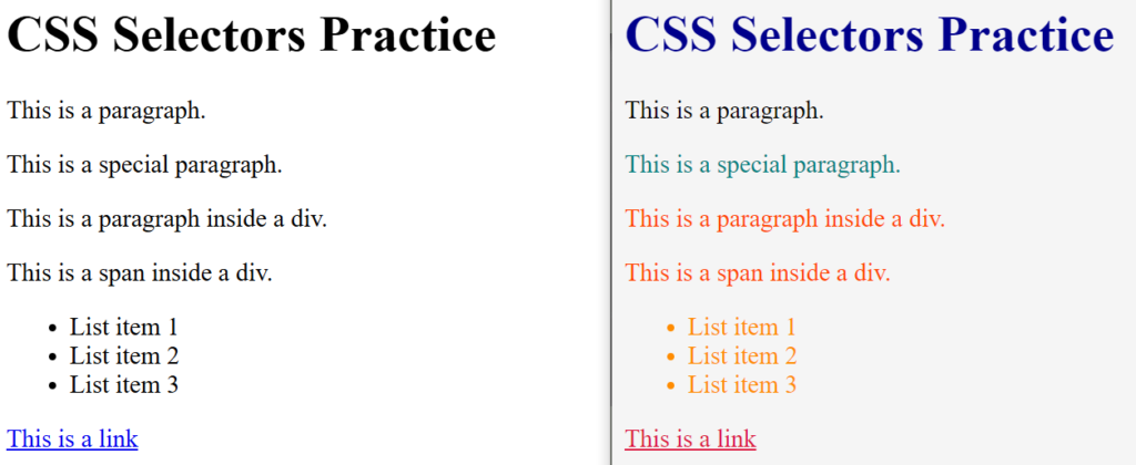
}Task 1
Step1: Create the below HTML Structure in a file named “task1.html“
<body>
    <h1>Welcome to CSS Selectors Practice</h1>
    <p>This is a paragraph.</p>
    <p class="special">This is a special paragraph.</p>
    <div id="container">
        <p>This is a paragraph inside a div.</p>
        <span>This is a span inside a div.</span>
    </div>
    <ul>
        <li>List item 1</li>
        <li>List item 2</li>
        <li>List item 3</li>
    </ul>
    <a href="#">This is a link</a>
</body>
Now Create a CSS file named “task1.css” and link it with “task1.html” using <link> tag and complete the below selector-color task
Box Model
Every HTML element is treated as a box with:
- Content – The actual content area
- Padding – Space between content and border
- Border – Line around the padding
- Margin – Space outside the border
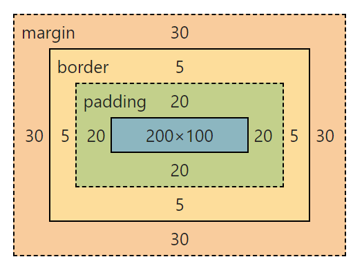
.box {
    width: 200px;          /* Content width */
    height: 100px;         /* Content height */
    padding: 20px;         /* Space inside the box */
    border: 5px solid black; /* Border for the box */
    margin: 30px;          /* Space outside the box */
}
Layout Magic
display: flex:- This enables Flexbox layout for the
.container. - Flexbox allows the child elements (in this case, the
.boxelements) to be laid out in a flexible way, either horizontally (row) or vertically (column). By default, Flexbox aligns items in a row.
- This enables Flexbox layout for the
gap: 10px:- This adds a 10px space between the child elements (the boxes) inside the container.
- The
gapproperty is a shorthand forrow-gapandcolumn-gap, making it easy to add consistent spacing between items.
width: 100px:height: 100px:- Sets the width & height of each box to
100px.
- Sets the width & height of each box to
border: 2px solid black:- Adds a 2px solid black border around each box.
text-align: center:- Centers the text horizontally inside the box. However, this property only works for inline or inline-block elements. Since we’re using Flexbox, this property isn’t strictly necessary here (Flexbox handles alignment better).
display: flex:- Enables Flexbox for the
.boxitself. This allows us to use Flexbox properties to align the content inside the box.
- Enables Flexbox for the
align-items: center:- Vertically centers the content inside the box. This works because the box is a flex container (due to
display: flex).
- Vertically centers the content inside the box. This works because the box is a flex container (due to
justify-content: center:- Horizontally centers the content inside the box. This also works because the box is a flex container.
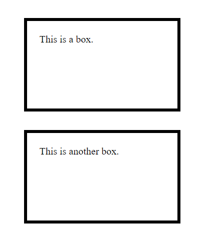
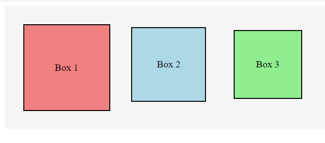
Task 2
Instructions:
- Create 3 boxes with the following properties:
- Each box should have a width and height of
100px. - Each box should have a border of
2px solid black. - Assign the following background colors to the boxes:
- Box 1:
lightcoral– Box 2:lightblue– Box 3:lightgreen
- Box 1:
- Each box should have a width and height of
- Add the following spacing:
- Box 1: Margin:
10px– Padding:20px - Box 2: Margin:
15px– Padding:10px - Box 3: Margin:
20px– Padding:5px
- Box 1: Margin:
- Use Flexbox to display the boxes side by side with a gap of
10pxbetween them.
Colors and Typography
body {
  color: #333333;
  font-family: Arial, sans-serif;
  font-size: 16px;
  line-height: 1.6;
}
Flexbox and Grid
Modern CSS provides powerful layout systems:
/* Flexbox Example */
.container {
  display: flex;
  justify-content: space-between;
  align-items: center;
}

/* Grid Example */
.grid-container {
  display: grid;
  grid-template-columns: repeat(3, 1fr);
  gap: 20px;
}
Responsive Design
Make your website look great on all devices:
/* Media Query Example */
@media screen and (max-width: 768px) {
  .container {
    flex-direction: column;
  }
}
Best Practices
- Use meaningful class names
- Keep your CSS organized
- Comment your code
- Use CSS reset or normalize
- Minimize specificity conflicts
- Follow a consistent naming convention
Common CSS Properties
Here are some frequently used properties:
.element {
  /* Dimensions */
  width: 100%;
  height: auto;

  /* Spacing */
  margin: 10px;
  padding: 15px;

  /* Visual */
  background-color: #f0f0f0;
  border-radius: 5px;
  box-shadow: 0 2px 4px rgba(0,0,0,0.1);

  /* Typography */
  font-size: 16px;
  font-weight: bold;
  text-align: center;
}
Next Steps
Now that you understand the basics, try:
- Building simple layouts
- Experimenting with different properties
- Creating responsive designs
- Learning CSS frameworks like Bootstrap or Tailwind
- Practicing with real projects
Conclusion
CSS is a powerful tool that brings life to your web pages. Start with these basics and gradually build your knowledge. Remember, practice is key to mastering CSS. As you continue learning, you’ll discover more advanced concepts and techniques to create even more impressive designs.
Keep practicing, experimenting, and building projects to improve your CSS skills. Happy coding!